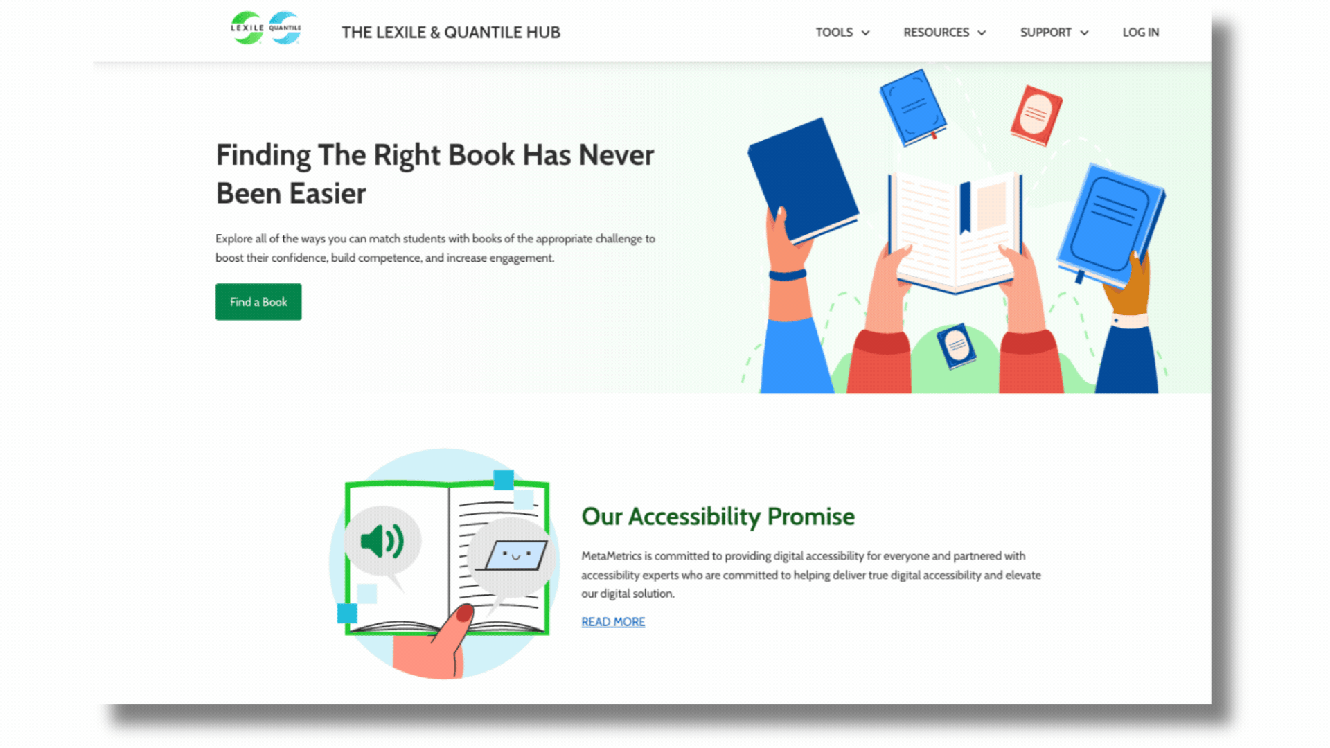
Educators and accessibility advocates, we’re back with another sneak peek of the new, redesigned Lexile and Quantile Hub! We’re beyond excited to share some insider news with you. As you know, this fall, we’re relaunching the Lexile and Quantile Hub with a ton of new accessibility features that are going to make your experience smoother and more inclusive. We’ve worked hard to meet WCAG 2.1 AA guidelines, and we’d like to take you behind the scenes, or in this case, behind the screen, to share some of the updates for you!
Why Accessibility Matters to Us
Accessibility isn’t just a checkbox for us—it’s at the heart of what we do. We want everyone, regardless of their abilities, to get the most out of our content and tools. And guess what? Even if you don’t use accessibility supports, you’ll still love the changes. The site will be more streamlined, with a cleaner design and easier navigation. Because many accessibility features are largely invisible to users who do not use assistive tech, we’ve done our best to illustrate the updates in this blog post. Some of us, at MetaMetrics, have worked in the classroom with students, including those with disabilities. Others of us have children with disabilities or even have disabilities ourselves. We understand how frustrating it can be to approach a piece of technology or a situation only to be blocked from being able to use it. We know that online technology needs to be made available to all and we are committed to working toward that effort.
Testing, Testing, and More Testing
MetaMetrics’ amazing developers and the Product team have been using all sorts of cool tools to experience the site just like you do. These tools help us spot any bumps in the road and smooth them out before you ever encounter them. Some of our favorites include the Wave Accessibility Evaluation Tool (WAVE), the Web Disability Simulator, the Axe Toolkit by Deque, and the ARC Toolkit by TPGi. These are free browser plugins that make it easier to test and experience our site in a way that is similar to those with disabilities. It also allows us to see otherwise invisible/inaudible features for those without assistive technology.
🔑 Key Accessibility Features that Unlock a Great User Experience
Here are some of the accessibility features we have implemented to enhance the user experience:
1. Skip to Content
You know that little “skip to recipe” button on cooking blogs? Yes, we love it too. This feature is similar. It’s invisible unless you press the “tab” key on your keyboard but once you do, it allows you to bypass all the menus and access the main content directly. This is especially critical for a visitor using a screen reader because it can tell the tech not to read the nested menus before getting to the copy. This can save quite a bit of time if a user does not need to hear the menus.
2. Aria Labels
Aria labels are like little helpers that tell assistive technology what each interactive element is. So when a screen reader encounters a button, it knows exactly what it is and does. We’ve crafted these labels with care, and they’re tested regularly. We support NVDA and JAWS screen readers. Though not one of the supported programs for Hub, some users have found Mac VoiceOver can also be used to hear on-screen text read aloud.
3. Focus Order
If you navigate with a keyboard or an enlarged browser, you’ll appreciate our “focus order” feature. It puts a box around titles, headers, and links as you move through content in a logical sequence. No mouse required! It can also be handy to tab through content if you hold a fork while you eat at your desk (guilty!).

👉Fun Fact: At MetaMetrics, we use the word “select” instead of the word “click” because not everyone uses a mouse. Inclusive language makes a difference!
4. Secondary Visual Cues
The Web Disability Simulator has been a game-changer for us. It lets us see how users with different conditions that affect vision may experience our site. For example, when using the color blindness simulator, we realized color alone wasn’t enough to differentiate chart areas in the Lexile® and Quantile® Growth Planners tools. To correct this, we added various stripe patterns to ensure a user who lacks color perception can perceive the differences.

5. Enhanced User Interactions
We’ve also fine-tuned how you interact with the site. In the Lexile® Find a Book tool, any input that changes the page (like sorting by Lexile® measure) now requires your confirmation. Plus, the focus order indicator box will include the filter term so screen readers can keep you informed about applied filters. These may seem small, but they add up to create a much smoother, more intuitive experience.
🗓 Coming This Fall!
We can’t wait for you to explore these enhancements this fall–the Lexile and Quantile Hub is about to get more inclusive and user-friendly. Thanks for being part of our community and supporting our mission to make education accessible to all!
🔥 One last hot tip: If you are an educator who already uses the Hub, please log into your account using your current school email address! This is important if your email address has changed because you’ve moved schools/districts or if you were previously using a non-school email address (like Gmail, etc.).